 |  |
| |
|  |
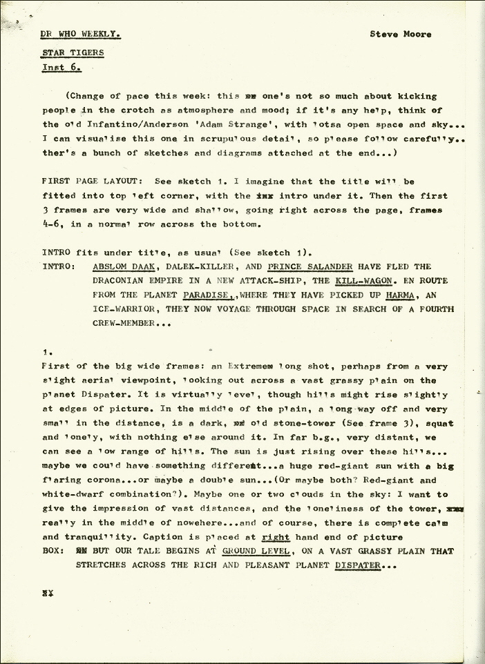
| | | | | | | | | | | | | This section of the site reproduces one of Steve Moore’s original scripts for Star Tigers, and Steve has kindly taken the time to provide a detailed commentary on the text. So, without further ado, it’s over to Steve... “This is, of course, the notorious episode where, at the last minute, it seemed that Terry Nation was possibly going to withdraw his permission to use the Daleks, so we had to replace them with Kill-Mechs. This led to some very hurried revisions, and I think I may have had to go into the office and write the dialogue changes on the spot (although phoning them through is another possibility – I certainly didn’t produce anything in written form); while a couple of panels needed artwork revisions as well. Looking at the printed pages again, I’d guess Paul Neary made the art changes in the office, though they don’t really stand out too much from the rest of the art, by David Lloyd. As it happened, of course, Nation didn’t withdraw the Daleks, and the dialogue revisions I hurriedly wrote for episode seven were unnecessary, and weren’t used; and thankfully when the story was reprinted in the 1990 Abslom Daak Dalek Killer collection the script and art were mostly restored to the original. However, the 1985 American colour reprint, in Marvel’s Dr Who No. 11, used the first-printed (Kill-Mechs) version; this was coloured, not very subtly, by Andy Yanchus. What made this all the more excruciating, of course, was that episode six was my favourite in the entire series, with its introduction of Vol Mercurius, who I look back on with even greater affection than Daak himself, and its more poetic and atmospheric handling of events. But then the comic book industry does that sort of thing… the more you care about something, the more likely it is to go wrong. Going through this script again, which I probably haven’t read since it was written thirty years ago, is a bit like an archaeological excavation. When I got to panel 4 and came across a reference to some character notes, my immediate reaction was: “What? I don’t remember any character notes?” But eventually I found them: they were only two pages long, and had somehow got lost among all the other scripts and paperwork in the file, so here they are. It appears they were written for Steve Dillon sometime around the beginning of scripting Star Tigers. Still, trying to place them (were they written for Steve or David?) meant that something then clicked in my memory. I now think that the sequence of events regarding the artist change-over from Steve Dillon to David Lloyd must have gone something like this: David was brought in to draw episode four at very short notice (we were still on a weekly schedule at the time) and, then, as there was a natural break at the end of that episode, the remainder of the story was delayed to give him more time to draw the remaining three episodes. At least, I think that’s what happened…!”
| | | |  | | |  | | | | [FIRST PARAGRAPH]
Adam Strange, written by Gardner F Fox, drawn by Carmine Infantino and inked by Murphy Anderson was, apart from being one of the most beautiful science fiction strips ever produced, my introduction to American comics as a young teenager, and, despite everything I’ve seen produced before or since, probably still the strip I hold in the greatest affection to this day (though everything produced after the original run has been ruinous). I think David Lloyd did a brilliant job here, as he did on all the episodes he drew, but one still can’t help wondering how it would have looked if Steve Dillon had continued through to the end of the series. | | | | | | | | | [FIRST PAGE LAYOUT]
Well, the first thing that’s obvious here is that David ignored my idea for a page with four banks of pictures, with panels 4, 5 and 6 on the last bank! Not that I minded: the page still works really well. The idea for three wide horizontal panels probably reflects Infantino’s influence. The slow closing in on the tower was me trying to be “cinematic”; nothing special these days, but back then there was much less experimentation than now. | | | | | | [INTRO]
Quite why it was thought necessary to add the words “convicted murderer” to the beginning of this caption, I’ve no idea. It was obviously a late decision, as these two words are lettered in a different hand to the rest of the caption. The planet Paradise, mentioned here and seen in more detail in the previous episode, was a toned-down version of the planet Depravity, which I’d featured earlier in the strip Three-Eyes McGurk & His Death-Planet Commandos, the story that introduced the character Axel Pressbutton. Both Alan Moore and I continued to set stories on Depravity, in The Stars My Degradation and Laser-Eraser & Pressbutton; and if you thought Paradise was weird, believe me, Depravity was far, far worse! When reprinted in the book version, this caption was replaced by: “In the last few months, whole worlds have fallen to the terrifying might of the Daleks. But even the deaths of millions has not sated their lust for power, for final victory…” While this is unobjectionable enough in itself, the only reason I can see for it being here is to provide a link to the caption in panel 1, which starts with “but” and follows directly from the intro, contrasting “space” and “ground level”. Unfortunately this new caption really doesn’t work: there’s no connection between anything in the replacement caption and “ground level”. I need hardly say that I wasn’t responsible for this. | | | | | |  | | | | 1.
Well, in the printed version we didn’t get the red giant or the double sun, which is a bit of a shame, but the sunrise is nice. The placing of the caption is a bit strange, though, as it’s not really clear whether it belongs in panel 1 or 2; it should probably have been a little further right, and at about the same level as the intro. By this time, I was starting to move away from using a lot of captions; but, of course, in an otherwise largely wordless sequence, they’re reasonably legitimate here, if still a little over long. The whole idea of placing Mercurius in a small tower probably comes from the fact that there’s actually an 18th century memorial near my home called Severndroog Castle, which is a three-storey triangular tower, with arched windows, turrets, etc. Though somewhat decayed these days, when I was a kid it was possible to pay a silver sixpence and go up to the top to see the sights, and I always rather fancied living somewhere like that; so it was a perfect place for Mercurius, a character who probably represents my idealised vision of myself more than any other character I’ve written. | | | | | | | |
| | | | 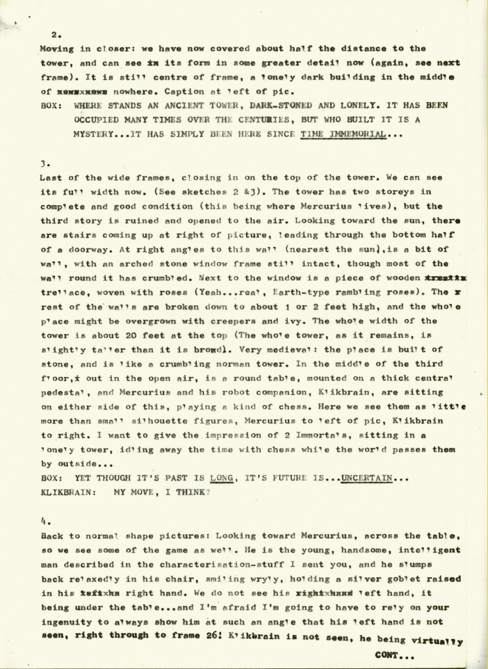 | | | |  | | | |  | | | |  | | | |  | | | |  | | | |  | | | |  | | | |  | | | |  | | | |  | | | | STAR TIGERS – CHARACTER NOTES [These character notes appear to have been written for Steve Dillon, sometime early in the Star Tigers run, though I’d guess I must already have written at least some of the scripts, as I talk about the Kill-wagon as if he’d know what it was. They’re very much of their time, but here they are, unedited, apart from the odd explanatory note in italics - SM.] ABSLOM DAAK Daak is, by virtue of his manic personality, the leader of the crew, though not perhaps the most important as far as running the ship. The breakdown of the jobs is Salander – pilot; Mercurius – navigator; Daak – front turret; Harma – rear turret… Daak taking the front turret because he likes to be right there in the action, shooting. You’ve more or less set his visual appearance, but if I was thinking this straight into pictures without using an artist, Daak would be a lot less muscular… at the moment he looks rather like Nick Fury in a Conan outfit (this is probably as much my fault as anything, as I tend to write him like Fury… but then Fury was a perfect vehicle for my line of dialogue, so I guess it’s carried over [Steve Dillon and I had worked on Nick Fury together, for Hulk Weekly, shortly before Doctor Who Weekly began])… but I originally saw him as someone less heroic… positively anti-heroic, in fact. He’s more of a back-stabber and a groin-kicker than a jaw-puncher. Think we should tone down on the wolfish grins a little and, especially as far as episode 4, play up his sullen miserableness. Visually, Daak should be as dark as his name suggests: he is death itself, dark-eyed, dark-robed, dark-minded… if you want it in Jungian terms, he’s a negative Shadow stalking through a dark, chaotic unconsciousness. Maybe, especially aboard the Kill-wagon, you should try to draw him a lot in the shadows, skulking in corners, appearing out of the darkness like a vicious emanation of the night itself. Explosively erratic and likely to strike you dead without reason. Lots of slump-shouldered sullenness, moody staring out from below dark eyelids, snarls (a crazy notion occurs to me… maybe in the three days he’s detained with Salander his beard grows a bit longer and darkens his face… but maybe it wouldn’t work…). Basically Daak is a defeated man: in a dark and vicious universe, he has fallen in love with a beautiful lady, only to have her snatched away from him before he gets anything out of it (and not for the first time); unable to forget, he drags the useless baggage of a lost dream through his life with him (graphically represented by Taiyin), and in private moments is to be found communing with her frozen remains, sadly. This is his major weakness, which Mercurius will play upon, when he finds out about it. The first time he lost his girl, he retreated into vicious bravado and “savage cool” to cover the emptiness within (as in the first story). The second time he becomes much more miserable, and though he has sworn to destroy every Dalek in the universe, this is really just something to do until he gets killed… nothing at all matters to him any more, and he knows as well as everyone else that reviving Taiyin is a vain hope, but he just won’t let it go… TAIYIN Taiyin is dead, and remains dead… though later she might open one eye… though I haven’t thought of the reasons for this yet, or its consequences… SALANDER You should have got his character from the script, I should think. Upright, honourable, honest, loyal, pragmatic, dignified. He is the “Elder Statesman” of the crew, calming down fights, frequently providing a sympathetic foil, but generally unable to understand the incomprehensible humanness of Daak and Mercurius. Master of the ship and its weaponry. He is, of course, seven feet tall, like all Draconians (that should make Daak look a bit smaller!). Rarely smiles, if ever. Secretly laments his lost son. Really gone off members of his own race since Axiron. HARMA The Ice Warrior is also about seven feet tall, but he’s really one of the good guys, big, bulky, cuddly, innocent, simple, smiles a lot in childish glee (if it’s possible to have a grinning Ice-Warrior?!), but really sees nothing wrong in tearing down walls and breaking people’s backs if they offend him, or if he’s told to. He’s the muscle-man of the group, a friendly Hulk. He is devoted to Daak like a faithful dog (for a reason I haven’t thought of, but might make a story of later). He remembers his samurai-type code of honour (didya know that samurai “honour” allowed them to cut down peasants in the street, just for looking at’em?) and becomes upset if he has to break it. He’s the big teddy-bear of the group, and always on Daak’s side in a dispute. VOL MERCURIUS I’m determined to have one small wiry person in this thing, and Mercurius is he! The guy I have in mind to play the part is a Chinese film-actor called David Chiang (he was in Legend of the Seven Golden Vampires), of whom some stats are attached overleaf. Mercurius is not Chinese, but he has a small, fine-boned intelligent face, almost boyishly good-looking; a direct contrast to Daak’s vile uncouthness… he is positively sleek. If Daak is 6ft tall, Mercurius is 5ft 6in (in the stats he [Chiang] is surrounded by other small, wiry Chinese gentlemen, so his diminutiveness is not immediately apparent!). I think the first stat is about the most important for character and expression, and hope you can see what I do in it [These stats have mostly gone missing, though the first was from New One-Armed Swordsman]. Up to you if you want to keep his hair in the same style, gathered up in a top-knot and queue … I kinda like it, but you might think it too close to Daak’s style … on the other hand, the male pony-tail might be all the rage among the robbery and piracy set in the 26th century. Similarly, up to you if you want to keep the same sort of loose-trousers, tunic and boots costume (see third stat)… I kinda like that too, but it should definitely not be white… maybe black or fairly dark. He is not normally armed, drawing his weapons from the ship’s arsenal as necessary. He is the guy who ran off with Selene, Daak’s girl of long ago. Daak hacked off his left hand by way of compensation, and he now has an ugly metallic replacement, marring the perfection of his youthful good looks. This robot hand is similar in size and shape to a normal hand, but its surface is made up of metal plates, not artificial skin. It has no particular powers (so far) but is useful for tearing off door-handles and breaking jaws. He and Daak really don’t like each other at all, though there is mutual respect. Daak has brought him along out of a vicious desire to avenge himself on one of the authors of his misfortune by controlling his destiny, playing with him … content for him to be alive, though Daak has sworn that Mercurius will not outlive him. Unfortunately, he soon finds that Mercurius can be equally tormentive in return. Mercurius is basically with them because he has nowhere else to go. Mercurius, as his name suggests, is extremely quick-witted and intelligent, with a mind as nimble as his body. He knows much and has brilliant plans (which Daak is loath to accept) and he has, in the past, used his brain to make much money, usually through fraud or robbery… he and Daak were working partners at one time in the past. He has no time for conscience, and sees nothing immoral in robbing or killing to get what he wants… he merely gets on with what he wants to do without worrying about ethics. He has lots of cool and panache (he might casually toss a knife over his shoulder without looking and bring down an assassin twenty paces away). Very much speed, nimbleness and brain, so please draw him small and as unlike Daak s possible. Rather arrogant and flash, and unsympathetic to human problems… |
| | | | 2.
Although I can’t fault David here (it’s hard to show a grassy plain as anything else as than a blank, after all, and that’s what I’d asked for), looking back at this, the background round the tower just looks too empty. My fault, but this one didn’t really work, though it looks a bit better in the colour reprint, where the background is, at least, green. |
| |
| | | | | | | | | | 3.
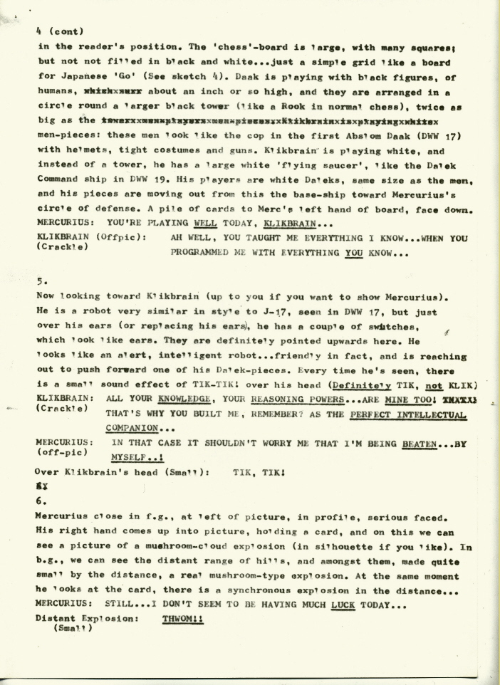
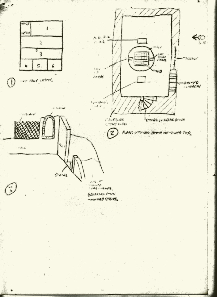
Okay, so the first thing that’s obvious here is that I couldn’t spell the word “trellis” back then! God knows where “trellace” came from! I added a couple of very crude sketches to the script (see here), which was a lot easier to do in the days of typewriters and carbon-paper (no fiddling about with Photoshop back then!), The ivy obviously didn’t make it on to the tower, but that was nowhere near as important as the roses. These basically came from the Grateful Dead, my favourite band at the time, who had a running motif of roses and skeletons on the covers of their albums, a particularly fine example being the live double album of 1971, simply called Grateful Dead, with a magnificent rose-draped skeleton drawn by Kelly. That image is almost certainly responsible for the use of roses here, and may even have influenced the use of Klikbrain; after all, it’s not a great leap from skeleton-and-roses to robot-and-roses. Unfortunately, this panel really needed to move in just a little closer: we can just about see Mercurius and Klikbrain sitting at the table, but their minuteness, combined with the poor printing, makes them almost impossible to spot. And we have the same problem with the background again; but weirdly, in the colour version, after providing a green background to the first two panels, this background has been left completely white, which baffles me completely. In all the following panels, I actually asked for Klikbrain’s dialogue to be put in a “crackle”-edged (i.e. zigzag) balloon-border, but obviously forgot here. On the printed page it’s consistent with Klikbrain’s other balloons, however, because although it’s got a normal border, it actually has a “crackle” balloon-tail. I suspect this comes down to the fact that crackle balloons take longer to do, and lettering didn’t pay much. | |  | | | | |  | | | 4.
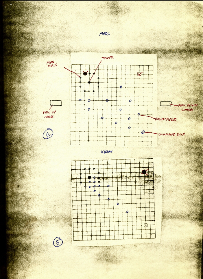
So here I am as I’d like to see myself (draw your own conclusions!), though hopefully I’m not quite as cold-blooded as Mercurius. The inspiration for the character was actually Zhuge Liang (181-234AD), a real person who was prime minister of the state of Shu in China with a reputation as a military strategist, inventor and all-round genius, who legend has made something of a Merlin figure. He features heavily in a classic novel, The Romance of the Three Kingdoms, on which numerous movies and computer-games have been based, and he’s been an obsession of mine since the early 1970s, as well as the subject of some of my non-fiction writing. Obviously, though, I needed an SF name, rather than a Chinese one, and to my mind the nearest equivalent western figure to Zhuge Liang, reflecting intelligence, cunning and deviousness, was the wing-footed god Hermes or Mercury. “Vol Mercurius” is, of course, “Flying Mercury”. Having come up with the name, there was the look to consider. As you’ll see from the character notes, I wanted someone small, wiry and quick so, while not wanting him to appear particularly Chinese, I based him on the actor David Chiang, star of many Shaw Brothers martial arts movies in the early 1970s and a long-time favourite of mine, and attached a stat of a very moody photo of Chiang from New One-Armed Swordsman to the character notes. Asking David not to show Mercurius’s left hand until we get to panel 26 gave him a few problems, of course, but he carried it off perfectly. | | | | | |  | | As mentioned in the script, the “chess” being played here is similar in some ways to the Japanese Go, where each player tries to surround his opponent’s pieces with his own, though the idea of drawing cards as well is a new addition. Again, I attached a stat of a Go board to the script, with rough positions for the pieces I wanted in frames 5 and 20 drawn on it. The placing of the second balloon-tail is rather unfortunate here, as it rather obscures the human-shaped chess-pieces and the tower they’re protecting, and of course, these aren’t black pieces … though with hindsight making them black would have been difficult to handle. The idea of two people (okay, one of them’s a robot here) playing chess while the world totters all around them probably refers visually to Ingmar Bergman’s 1957 movie, The Seventh Seal (which I remember seeing in the late 60s or early 70s), where the lead character, a knight, plays chess with Death. I’m sure others have worked with the idea of “moves made on the game-board reflecting events happening in real life”, but the notion particularly appealed to me as the mutability of reality is a subject that’s interested me throughout my writing career. Of course, how the game and the war actually relate isn’t explained; that would have destroyed the poetry. | | | | | |  | | |
| | | | | | | | | 5.
Dear old Klikbrain… David did such a wonderful job in giving him an engaging personality that it really adds to the poignancy of the ending. I can’t really remember my thought processes here, but I’m guessing I just liked the idea of implying that he was something like a primitive clockwork robot (thus the ticking) while having a genius-level brain to match that of Mercurius. This is, of course, the first of the panels with artwork alterations in the first appearance, in DWM 45. The circular Dalek base ship was replaced with what looks like a large computer mouse, and the Daleks replaced with miniature Kill-Mechs. It’s only when I was looking at the art again while writing this that I realised that the Kill-Mechs are actually hovering just above the board, in the same way that the real Kill-Mechs do when they appear later on, which is a wonderful touch. Kudos to Paul Neary for that one. | |  | | | 6.
Not much to add here, but you’ll notice that this first page is the only one where I’ve attempted to instruct the artist about the page layout. After that, the script just runs straight through, and it’s left up to David. That was pretty much the way we did things back then, especially in cramming 30 panels into 4 pages: give the artist a headache and let him sort it out! These days, of course, especially with regard to American comic-books, everything’s constructed in my script: number of panels on a page, layouts, what’s happening when you turn the page, and so on. | | | | | |  | | | | | 7.
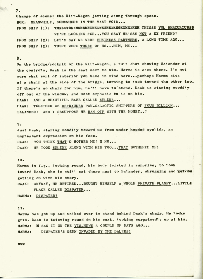
As far as the art’s concerned, this is just a link shot. Looking back, I don’t find the use of a caption that begins “Meanwhile” very satisfying. These days I’d try to make a more “artistic” link between the two scenes, probably using just dialogue. But that was the way we did things back then. | | | | |
| | | 8.
It’s obvious from the panel description here that I hadn’t really thought through the interior design of the Kill-Wagon. These days I’d have it scrupulously worked out in my head. A youthful failing. Or maybe just the hurry of writing a weekly strip (along with other things). |
| |
| | | 11.
Dialogue changes, in DWM 45. To the first balloon I added: “Some nut in the Jarith Cluster rebelled… calls himself emperor…” This was basically just to give some sort of back-story to the Kill-Mechs, and a reason for them invading Dispater. With the Daleks, of course, this would have been unnecessary, as invading planets is what they do naturally. I think Jarith was just a made-up name, with no significance. In the 1990 book, this balloon has been replaced by: “That’s good news for us, Abslom… bad news for your partner… very bad news – ”. As to why the book didn’t return to the original script, I have a couple of conjectures. One is that the editorial staff no longer had the original script. The other is that they would have been working with printer’s film, rather than the original artwork; this would mean that instead of being able to peel off the balloon-lettering to reveal the artwork underneath, which would have meant that this balloon could have been replaced with a smaller one, they were stuck with a balloon of a particular size that had to be filled. Unfortunately, whoever did this was an idiot, and this is possibly one of the most incompetent editorial interventions I’ve ever seen. We’ve lost the reference to the Vis-News, which explains how Harma knows what’s going on, and the idea that the man they’re looking for is in imminent danger of destruction can somehow be good news for Daak and crew makes absolutely no sense at all. Whoever was responsible for this should be thrown out of the airlock without a spacesuit… The second balloon had “the Daleks” replaced by “his Kill-Mechs” in DWM 45. |
| | | | 12.
The use of the “thought balloon” has completely disappeared from my work in recent years… it should be possible to get across any necessary information in spoken dialogue, and Mercurius could probably have spoken this aloud. But that was the style of the time. | | | 13.
Here I am making explicit the connection between the Para-Chess and the real world… | |
| |
| | | 14.
And here I am saying what a ridiculous idea it is. This is called having one’s cake and eating it too. |
| |
| | | 15.
I was actually being a bit naughty in this and the following two frames, by asking for inset pictures in the main panels, which effectively meant asking David to draw three extra pictures in an already crowded script, even if they were small. But it was really the only way to provide an immediate link between what was happening on the para-chess board, and what was happening in reality. |
| |
| | | 16.
Here we have changes again, for DWM 45. In both parts of the picture the Daleks have been replaced by Kill-Mechs. I don’t think I had any input on the design of the latter… I suspect I probably just said something like: “Okay, let’s replace the Daleks with some sort of fighting robot, and we’ll call them Kill-Mechs”, and the design was done by Paul. In the dialogue, of course, “Exterminate!” was too closely associated with the Daleks, so I simply replaced it with “Eradicate!”, which had the advantage of being about the same size when the relettering was done. In previous Abslom Daak strips (and elsewhere, I think) Daleks were always given crackle balloons, and the original lettering (before alterations) should have had them here. But, again, we have ordinary borders and crackle tails (see above, panel 3). |
| |
| | | 17.
Changes again, for DWM 45. Again we have Kill-Mechs rather than Daleks, and in the dialogue “Exterminate! Exterminate!” was replaced with “Eradicate the fleshy ones!!” Weirdly, when this panel was reprinted in the 1990 book, this balloon had disappeared completely… which makes me wonder if my conjecture about the use of film (above, panel 11) is actually right. With film, it would have been easier to add replacement words to the balloon, rather than make up the original artwork that would have been below it. Even with original art, a certain amount of correction would have been necessary to remove traces of the balloon. I’m baffled here. |
| |
| | | 18.
Again, the change of scene with “Meanwhile…” is very much of its time. A quick glance at the artwork will show that David’s ignored my instructions and replaced the scene of the Kill-wagon cockpit with a long-shot of the ship in space. I’d conjecture that this was to avoid two consecutive cockpit shots (though lack of space may have been a consideration as well), but as the dialogue identifies the speakers, it still works okay for story-telling purposes. Being hyper-critical, though, it means that both our major scene-changes feature long-shots of the Kill-wagon in space, which is a repetition that would be better avoided. |
| | | 19.
David’s taken the easier option here, and concentrated on the screen. Space is probably a consideration, but doing this also provides a seamless visual transition to the following panel, which works really well. “Nine hells!” has always been a favourite exclamation of mine. I probably got it from the nine circles of hell in Danté’s Inferno, but it’s a really handy phrase when you can’t actually use swear words. |
| |
| | | | | | | | | | | | | | |  | | | 20.
More artwork changes in DWM 45, with the Dalek chess-pieces replaced with Kill-Mechs and the ship changed. The problem here, though, is that the placing of the second balloon is absolutely awful, as it’s largely covering up the action on the chess-board, and should have been placed much lower down. If I knew who the letterer was, they’d be out of the airlock, too… | | | | | | 21.
Okay, so obviously I’m stretching things here in having Mercurius and Klikbrain blithely continuing their game without actually having noticed a rather large spaceship landing next to the tower, or Daak coming up the stairs and appearing on the tower-top. But a man has to be allowed a little artistic licence! And, yes, there’s an awful lot of coincidence going on here, but we’re back to my interest in various views of reality: here the game and the real world are finally coalescing, and the randomness of the joker/mirror-card provides the explanatory mechanism. And anyway, I’ve always been so familiar with coincidence in my life that I have no problem with it. | | | | | | |  | | |  | | | 22.
Sequences of silent or near-silent panels were still quite rare in British comics at the time. | | | | | | | | | |  | | | | | 23.
Credit to David for breaking down the script so that this panel fell at the end of page 3, which meant that the reader then turned over for the important “reveal”-shot of Daak on the following page. And he gave Daak a splendidly manic grin here. | | | | |
| | | 24.
The final, very minor, artwork changes in DWM 45, with the Dalek chess-pieces replaced with Kill-Mechs. David may have given a slightly over-exuberant portrayal of Daak here… he certainly looks as if he enjoys shocking people… but Klikbrain’s surprised expression is just about perfect. I’m not sure why the chainsword sound-effect went missing, but it doesn’t really make too much difference. The lack of dialogue is obviously a deliberate choice: Mercurius is too cool to say anything, Klikbrain’s too surprised, and Daak’s actions speak louder than words… |
| |
| | | 25.
I wanted Mercurius to be cool, calm and unsurprised under any circumstances, so he says nothing more that hello here. Obviously Salander didn’t get drawn here, but that isn’t really a problem as he didn’t have any particular part to play; and my notion of showing the rose-stalk cut down to size by the chainsword was obviously too difficult, though it would have been kinda cool if we could have pulled it off (this kind of flashy trick stems from my having seen far too many Chinese sword-fighting movies in the early 1970s). So we ended up with David visualising the frame from a different angle, but it still works well enough. |
| |
| | | 26.
David’s actually kept Mercurius sitting here, but that’s no problem. Some might think the robotic steel hand derives from the old British comic-strip, The Steel Claw, but I never actually read that at the time. It actually comes from the Irish mythological figure Nuada of the Silver Hand, a character I was considering for what would now be called a graphic novel, sometime in the early 1970s. Nothing ever came of that, so I just cannibalised the idea for Mercurius. Never throw anything away… |
| |
| | | 27.
So, back in panel 9 we had Daak representing how I actually felt about the lost lady; here Mercurius’ dialogue reflects me wishing I could forget and move on. Looking at the printed panel again, I think that throwing the letterer out of the airlock probably isn’t punishment enough. The placing of the third balloon here completely obscures the fact that Mercurius is crushing the rose in his robotic hand, which would have suggested that Mercurius was actually a little more upset about losing Selene than he let on. Grr… |
| |
| | | | | | | | |  | | 28.
David has actually transferred the falling rose-petals to the following panel, but as we haven’t been able to see Mercurius crush the rose, this no longer makes much sense anyway. In DWM 45, of course, the word “Daleks” has been replaced by “Kill-Mechs”. However, in the 1990 book, instead of just restoring the word “Daleks”, we have “I’m not leaving you behind for the Daleks, Vol…” Whoever was responsible for this obviously had no understanding of the character whatever: after what happened between them earlier, there’s absolutely no way Daak would have called Mercurius “Vol”, under any circumstances at all… not even when spitting on his grave. | | | | 29.
The letterer, for whom I’m developing an extreme posterior animosity, managed to omit Klikbrain’s balloon entirely here, even though there was plenty of room to position Mercurius’ dialogue further up the picture and place the missing small balloon over Klikbrain’s head. Needless to say, back in those days, scriptwriters didn’t get the chance to proof-read their own material. Of course, the missing balloon would have increased the poignancy of the ending considerably. David decided to split this frame into two, putting the actual switching off in a separate, wordless panel. I’ve no doubt he did this for practical purposes, just to emphasise an action that would have been lost in the larger picture, but it works brilliantly. Wish I’d thought of it myself, but I was probably concerned that the script was overcrowded already. | | | | | |  | | | |
|
|


")


